Everyone knows by now that colors produce a certain color effect in our subconscious. Which color does what exactly can be read in the countless books on color psychology. Red is the color of energy and warmth, acts like a magnet, and attracts attention. Blue, on the other hand, as a color of depth and coolness, makes us thoughtful and exudes a certain calm. Most of the time, however, we deal with the color effect when it comes to room design. But hand on heart, who has ever thought about whether the different color effects that influence our subconscious also have an impact on our eating behavior?

How restaurants make use of color
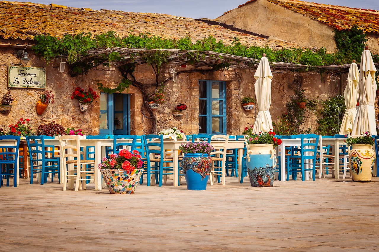
Whether the reddish shimmering wall design and the warm, subdued light in your favorite Italian is pure coincidence? Or rather calculated calculation? We are sure that it is the latter. Because as we already know, the color red has an appetizing effect on us. We are willing to eat beyond our hunger in a warm, reddish atmosphere and restaurant owners make regular use of this. Even the food industry uses this color effect. Whether it is the well-known logos of brands in the food sector or the design of food packaging, they all use the color effect of red. A rather rare image in restaurants, on the other hand, is a blue color concept. There are only a few restaurants that lure with blue walls or use blue table linen and dishes and if they do, this is mostly due to the origin of the national cuisine served. Because the effect of the color blue creates the exact opposite of what a restaurant wants: people eat almost a third less! On the one hand, this has to do with the appetite-suppressing color effect of blue in general, but also with the fact that the food is simply less appealing in a blue setting. Just pay attention to the wall design and the interior the next time you visit a restaurant. And if you are planning to build your own restaurant, you can visit for buying high-quality equipment for painting the walls of your restaurant.
How colors affect our taste
From an early age, we have heard the phrase “eat with your eyes” mediates and meets us in the most varied of ways in everyday life. Starting with shapely food like the sausage in the shape of a bear, to perfectionistically arranged plates in the gastronomy, and finally culminating under the hashtag Foodporn on Instagram, the visual effect on our appetite is exploited. But what is it all about? The sense organ for seeing – i.e. the eye – is closely linked to the two taste-determining senses smell and taste. If one of the senses, in this case, the sense of sight, is influenced, the whole taste changes for us. One and the same white wine, for example, changes its taste in the green light from sour to fruity in the red light. It is similar to the example of differently colored apple juice. While the natural-colored apple juice is also recognized like this, the red-colored juice is mistaken for currant juice and the green even for kiwi juice. The taste of food is also influenced by the color of the container in which it is served. Coffee from a white cup, for example, tastes less sweet, more intense, and more bitter. According to the German sociologist Eva Heller, we associate green and yellow with the sour taste, while pink, orange, and red with sweetness. In white, gray, or even blue foods, we expect something salty and we associate the colors purple, black, and brown with bitterness. Especially smart restaurateurs and food manufacturers play with the colors and the flavors that can be expected and surprise consumers when something does not taste as expected. So next time maybe just try the black ice cream, it may not be bitter at all!

